n2p blog
キャンペーンやSNSの
"ためになる"情報を
執筆しています。
WEB/スマートフォンサイトにおけるフォントサイズのベストな指定方法

更新日:2025.01.09 (公開日:2013/07/17)
諸説あるWEBサイトの文字サイズ指定。
現時点でベストなのかな~と思う指定をまとめてみました!
パソコン用サイト
[fusion_builder_container hundred_percent=”yes” overflow=”visible”][fusion_builder_row][fusion_builder_column type=”1_1″ background_position=”left top” background_color=”” border_size=”” border_color=”” border_style=”solid” spacing=”yes” background_image=”” background_repeat=”no-repeat” padding=”” margin_top=”0px” margin_bottom=”0px” class=”” id=”” animation_type=”” animation_speed=”0.3″ animation_direction=”left” hide_on_mobile=”no” center_content=”no” min_height=”none”][html] html {font-size: 62.5%;}body {font-size: 10px; font-size: 1.0rem;}
li {font-size: 14px; font-size: 1.4rem;}
[/html] remという単位はルート(html)を基準としたem指定です。
emや%指定でよくある「文字サイズ指定を入れ子にすると文字の大きさの計算がややこしい問題」が回避できます。
ルートであるhtml要素に対して62.5%を適用することで、基準サイズが10pxになります。
それに対して、1.0remを指定すれば10px
1.4remを指定すれば14pxになるよって計算です。
CSS3に対応しないブラウザのために、pxでの指定もしておくといいかなと思います。
サンプルはここをクリックしてくださいね!
ところがどっこい、上記サンプル、
ChoromeかSafariの最新版でご覧になると、
10px(今の設定では1.0rem)以下のフォントサイズは全て同じように見えてしまいます。
これはどうやら仕様変更なんだそうです。
小さい文字サイズって普通あまり使いませんものね。
今後は10px未満のフォントは画像で対応すると覚えておいたほうが無難かもしれません。
スマートフォン用サイト
[/fusion_builder_column][fusion_builder_column type=”1_1″ background_position=”left top” background_color=”” border_size=”” border_color=”” border_style=”solid” spacing=”yes” background_image=”” background_repeat=”no-repeat” padding=”” margin_top=”0px” margin_bottom=”0px” class=”” id=”” animation_type=”” animation_speed=”0.3″ animation_direction=”left” hide_on_mobile=”no” center_content=”no” min_height=”none”][html] html{font-size: 62.5%;}body{font-size: 1.4rem;}
[/html] こちらもパソコン用サイトと同じ考え方で。
CSS3に対応していないスマートフォンはないだろうという前提のもと、
pxでの指定は省いています。
(でも不都合あったら教えて下さい……)
サンプルはここをクリックしてくださいね!
※実機でご覧になる方がわかりやすいです。
こちらのサンプルも、Androidの標準ブラウザでは、
8px(今の設定では0.8rem)以下のフォントサイズは全て同じサイズに見えてしまいます。
8px未満のフォントサイズは再現しないのですね。
スマートフォンでは8px未満のフォントは画像で対応したほうがいいかもしれません。
また、「iOSのSafariでなぜか特定のfont-size(11px、10px、9px)のときだけマルチバイトの幅計算がおかしいのか、折り返し位置がずれる」
という問題も報告されています。
回避するには、該当要素に
letter-spacing: -0.001em;
を指定するとのこと。
よくわからない場合は、12px以上のフォントサイズが無難かもしれません。
フィーチャーフォン(ガラケー)用サイト
[/fusion_builder_column][fusion_builder_column type=”1_1″ background_position=”left top” background_color=”” border_size=”” border_color=”” border_style=”solid” spacing=”yes” background_image=”” background_repeat=”no-repeat” padding=”” margin_top=”0px” margin_bottom=”0px” class=”” id=”” animation_type=”” animation_speed=”0.3″ animation_direction=”left” hide_on_mobile=”no” center_content=”no” min_height=”none”][html] <div style="font-size:xx-small;">font-size:xx-small;font-size:xx-small;font-size:xx-small;font-size:xx-small;font-size:xx-small;font-size:xx-small;font-size:xx-small;
</div>
<div style="font-size:medium;">
font-size:medium;font-size:medium;font-size:medium;font-size:medium;font-size:medium;font-size:medium;font-size:medium;font-size:medium;
</div>
<div style="font-size:xx-large;">
font-size:xx-large;font-size:xx-large;font-size:xx-large;font-size:xx-large;font-size:xx-large;font-size:xx-large;font-size:xx-large;
</div>
[/html] サンプルはここをクリックしてくださいね!
※実機や各種シュミレーターでご覧ください。
フィーチャーフォン用サイトは昔懐かしのフォントサイズ指定です。
サイズの段階は上記三つ(大きい文字サイズはほぼ使わないので実質二つ)です。
xx-smallがちいさすぎるので、x-smallをオススメしてる本などが多いのですが、
mediumとの文字サイズの差が出ない機種があるので、
いつもはxx-smallを採用しています。
参考ページ
「フォントサイズの指定はCSS3の「rem」が便利そう」
「【スマートフォン向けサイト】フォントサイズの指定には、remを使おう。」
Google プロダクトフォーラム
「バージョン 27.0.1453.93 mより-webkit-text-size-adjust: none;の設定が効かない」
http://productforums.google.com/forum/#!msg/chrome-ja/7Y2r_dYFWrg/v6ohIV2x_FwJ
「スマートフォンサイトをデザインする上で知っておくべき10のTIPS」
http://blog.webcreativepark.net/2011/06/16-103025.html
「iOSのSafariで特定のfont-sizeのときの謎の隙間」
http://webtech-walker.com/archive/2011/03/30190850.html
「[/fusion_builder_column][fusion_builder_column type=”1_1″ background_position=”left top” background_color=”” border_size=”” border_color=”” border_style=”solid” spacing=”yes” background_image=”” background_repeat=”no-repeat” padding=”” margin_top=”0px” margin_bottom=”0px” class=”” id=”” animation_type=”” animation_speed=”0.3″ animation_direction=”left” hide_on_mobile=”no” center_content=”no” min_height=”none”][携帯]フォントサイズ(XHTML版)」
http://sakaki0214.com/2010/01/14045301.html[/fusion_builder_column][/fusion_builder_row][/fusion_builder_container]
-
リーチ最大化とエンゲージメント向上を実現するX運用戦略はこちら
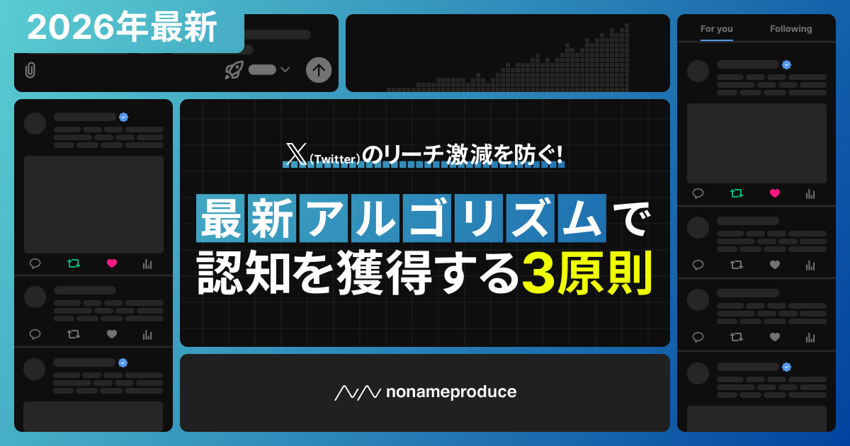
X(Twitter)のリーチ激減を防ぐ!最新アルゴリズムで認知を獲得する3原則
本資料では、xAIの最新モデル「Phoenix」をベースにしたXアルゴリズムの仕組みを徹底解説。従来の小手先テクニックでは通用しない時代において、AIに評価される投稿設計と、再現性のある運用戦略を具体的に紹介します。
-
APIをフル活用したInstagramプロモーション戦略はこちら

2026年のInstagram運用で成果を出すには?アルゴリズムの正体と「勝ちパターン」を徹底解説
本資料では、Meta社の大規模なAPIアップデートと最新アルゴリズムを徹底分析。従来型の「いいね」重視の戦略を超えた、APIをフル活用した次世代のInstagramプロモーション戦略を、具体的な仕掛けや事例と共に解説しています。

この記事を書いた人